Process summary
The general phases of my end-to-end process include research, exploration, and testing.
What's most unique about my process is the extra emphasis on user empathy.
Product design process flow
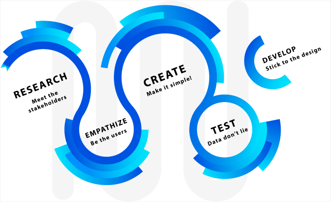
Click to see my expanded methods for each phase.
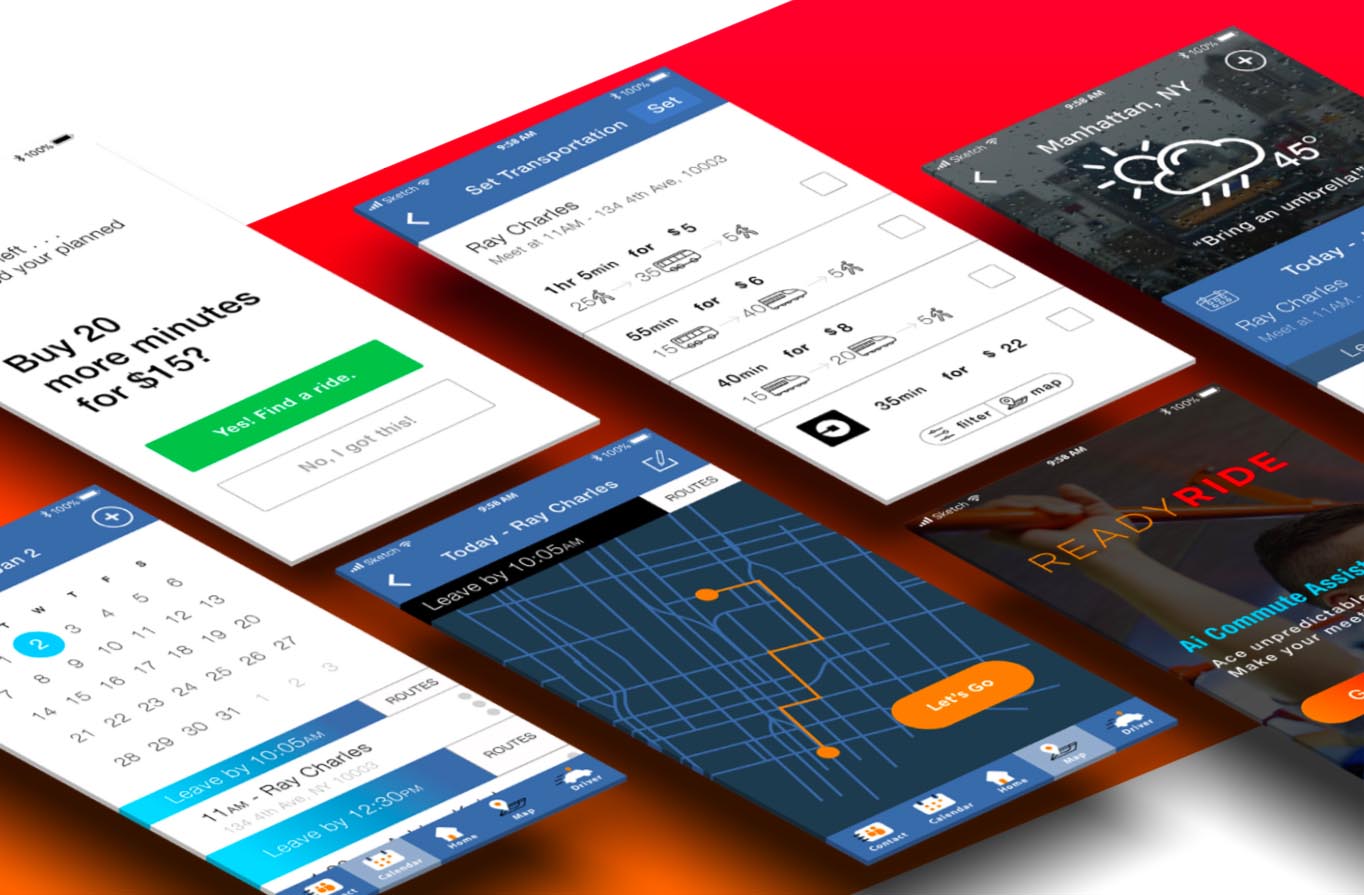
Expanded process case study
To read a real design breif and my response, please review
my 1-Week Design Challenge (8 min read)
on Medium.